Analytics and reports
See your farm in numbers: average weight, gain, profit per head, mortality and sales over any period you choose. Charts show where the money goes and how the flock grows. Advanced analytics is available on paid plans.
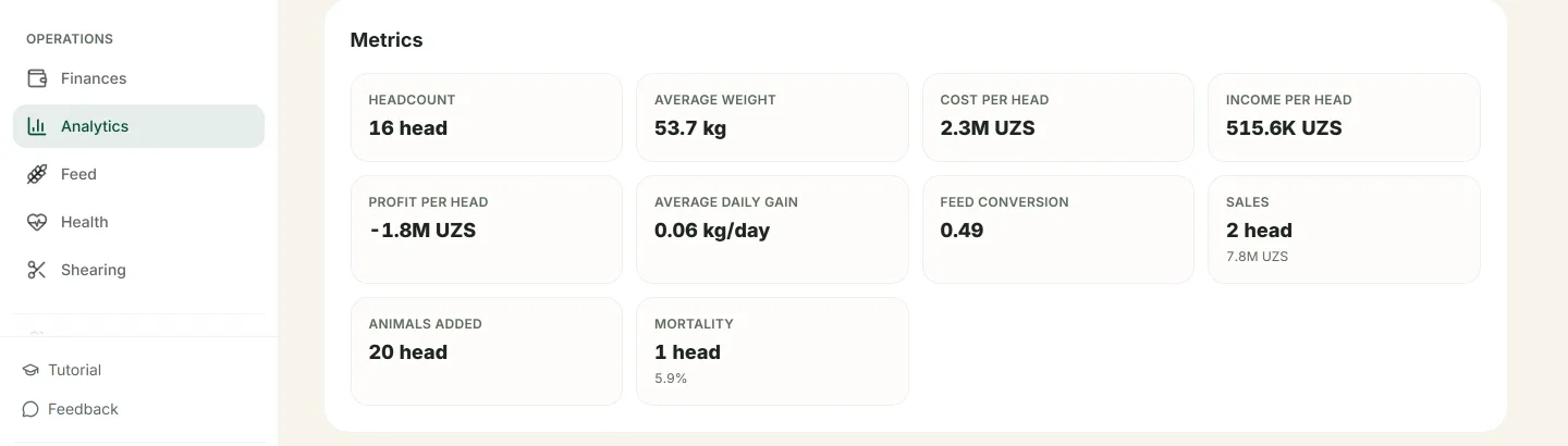
Flock figures for a period: weight, gain and profit per head.
How to read the reports
The Analytics screen
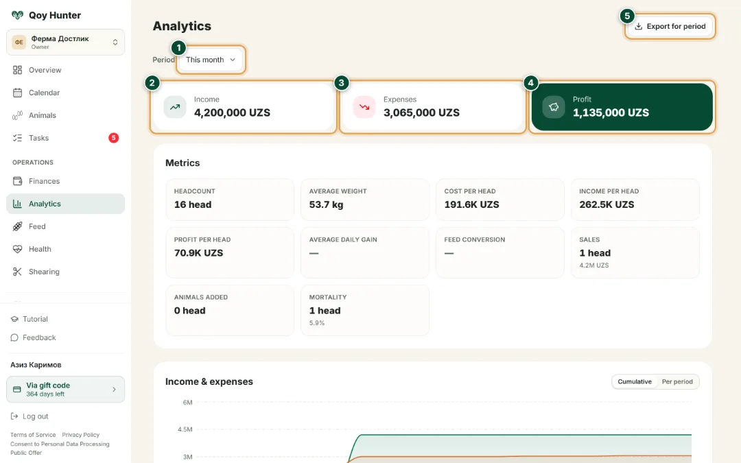
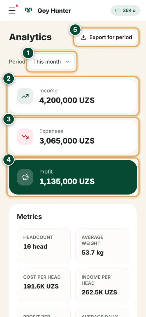
Your whole farm in numbers for the chosen period: the flock's income, expenses and profit — all on one screen.
- 1
Choose a period — this month, a quarter, a year or your own range. Every figure and chart recalculates at once.
- 2
Income for the period — all the farm's earnings: sales of livestock, wool and young stock.
- 3
Expenses — feed, vet care, medicines and buying animals, all in one place.
- 4
The flock's profit for the period — income minus expenses. You instantly see whether the farm earns or runs at a loss.
- 5
“Export for period” downloads the report to a file — for your accountant, a bank or a partner.
Key metrics
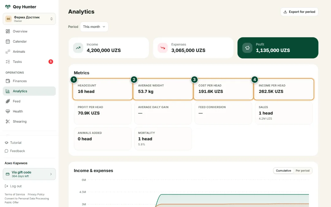
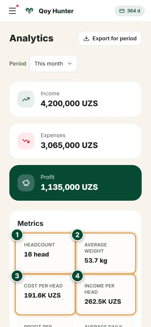
The “Metrics” block gathers the flock's main figures for the period: headcount, average weight, cost and income per head.
- 1
Headcount — how many head are in the flock at the end of the period. The base of all sheep records.
- 2
The average weight of one animal — gain and readiness for sale are calculated from it.
- 3
Cost per head — how much it costs to keep one animal over the period.
- 4
Income per head — revenue per animal. Compare it with the cost per head to see the profit.
Income & expenses trend
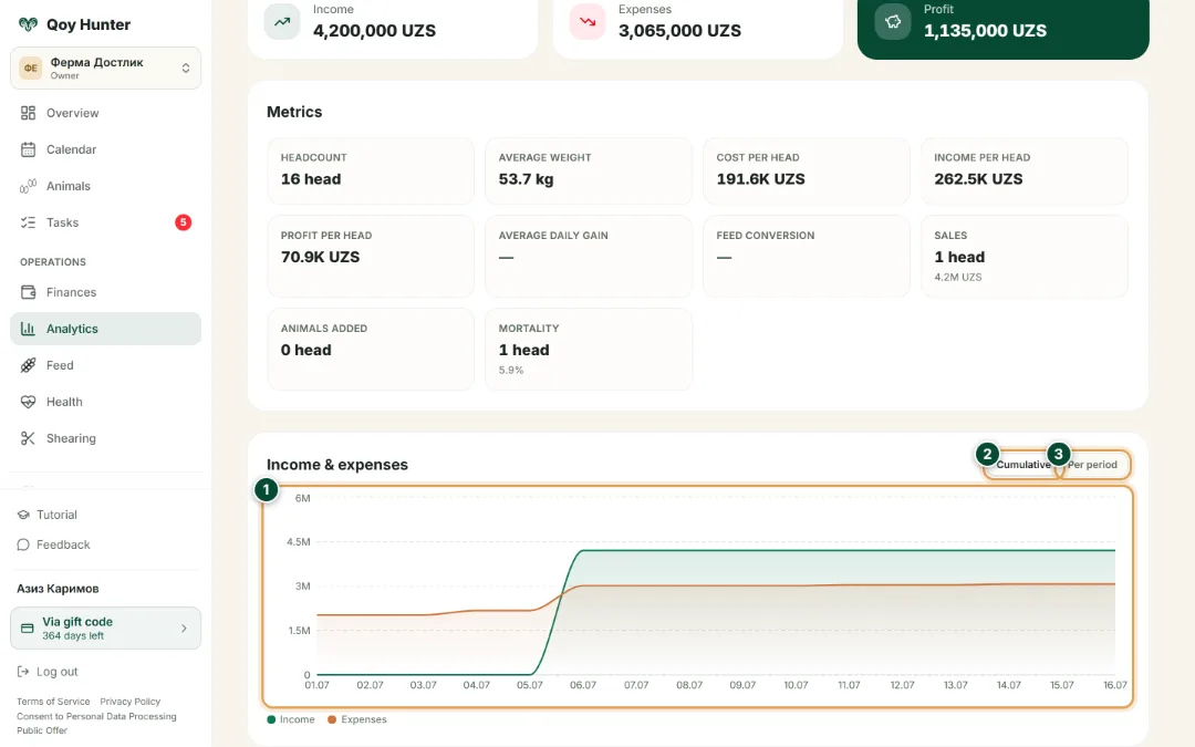
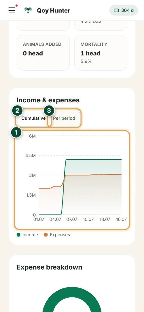
The chart shows how the farm's income and expenses change day by day — you see exactly when the flock turns a profit.
- 1
The income (green) and expense (orange) lines by day — the whole farm's dynamics on one analytics chart.
- 2
“Cumulative” — income and expenses as a running total: watch the flock's profit build up over the period.
- 3
“Per period” — the total for each day or interval: instantly spot where costs spiked or a big sale landed.
Expense breakdown
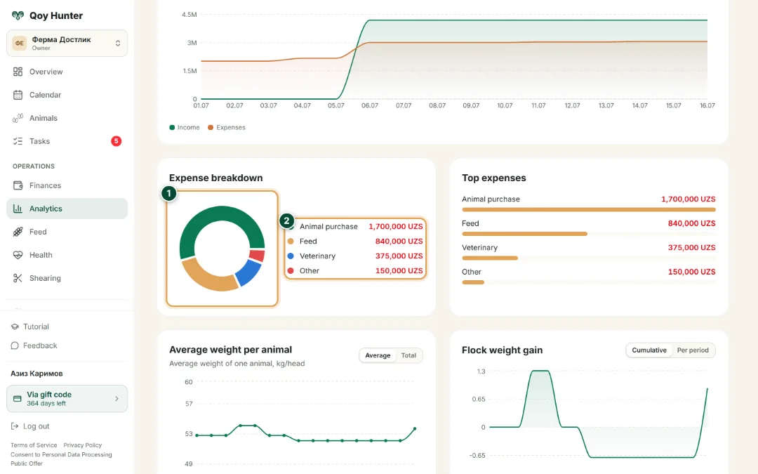
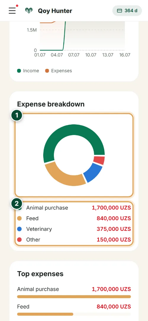
Where the farm's money goes: feed, vet care, medicines and buying animals — with the share of each item.
- 1
The expenses donut: shares of feed, vet care, medicines and buying animals — the main cost item stands out at once.
- 2
The breakdown by category with amounts — from the biggest items down. You see where to look to cut the flock's cost per head.
Average weight
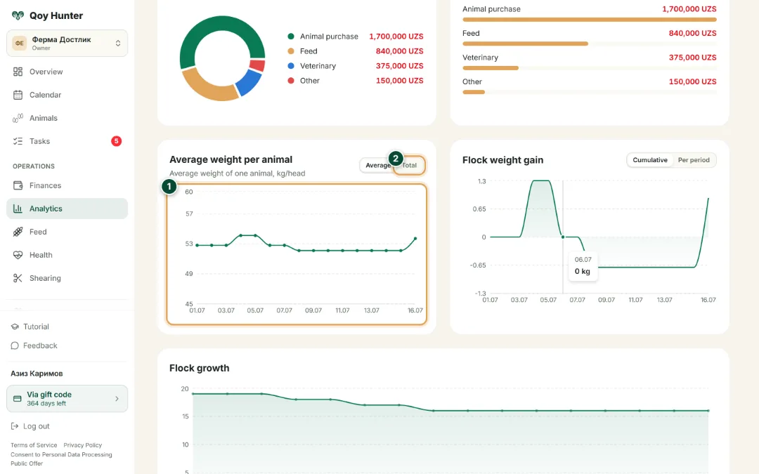
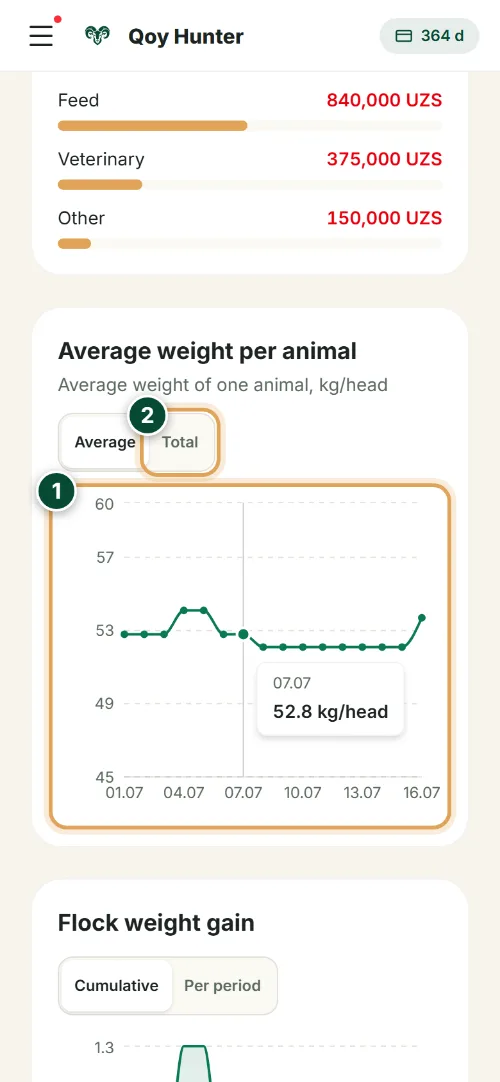
How the average weight per head changes over the period — it shows the gain and the rams' readiness for sale.
- 1
The average weight per head by day, kg/head — you can read the flock's gain at a glance, and with it the moment to sell.
- 2
Switch to “Total” to see the combined weight of the whole flock instead of the average per head.
Flock gain
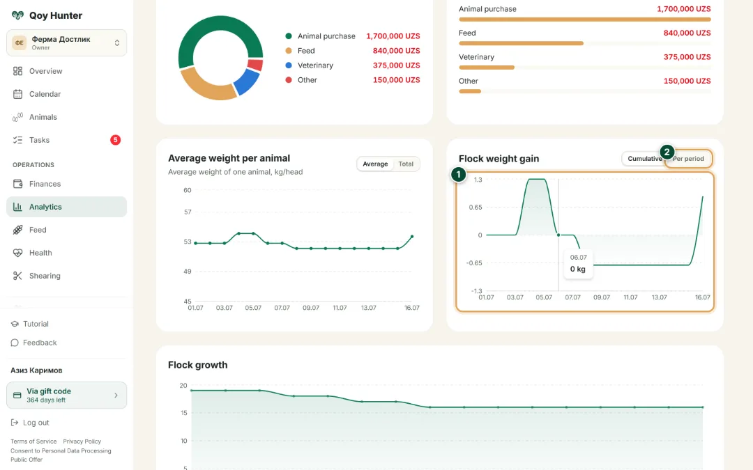
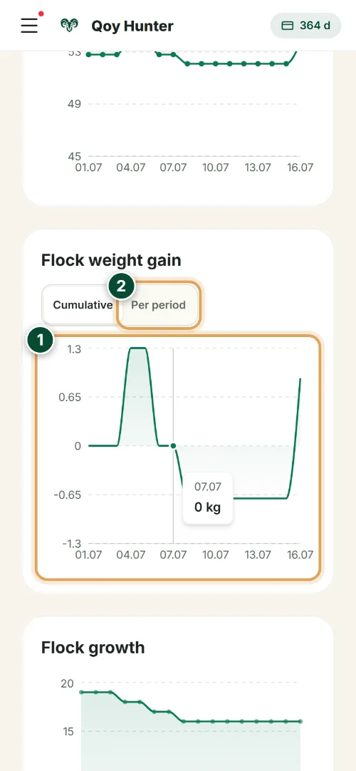
How many kilograms the flock adds over the period — a direct measure of fattening and feed efficiency.
- 1
The flock-gain chart: how many kilograms the herd added by day — you instantly see whether the feed pays off.
- 2
“Per period” — the gain for each day or interval; “Cumulative” — a running total across the whole period.
Headcount & breeds
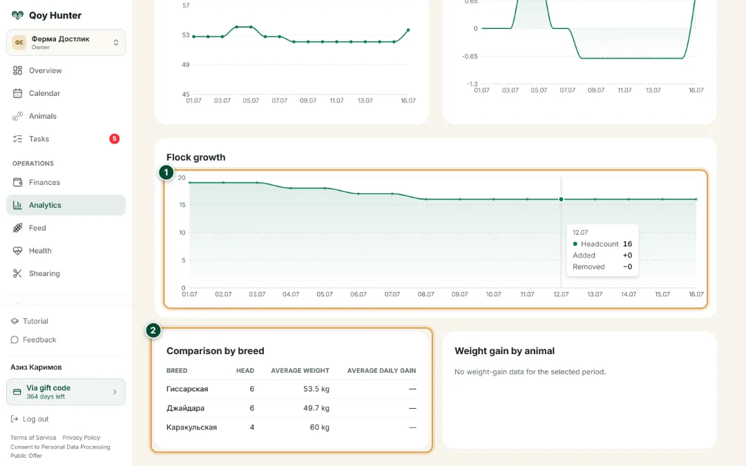
How the head count changed and how breeds differ by weight — the full picture of the farm's flock.
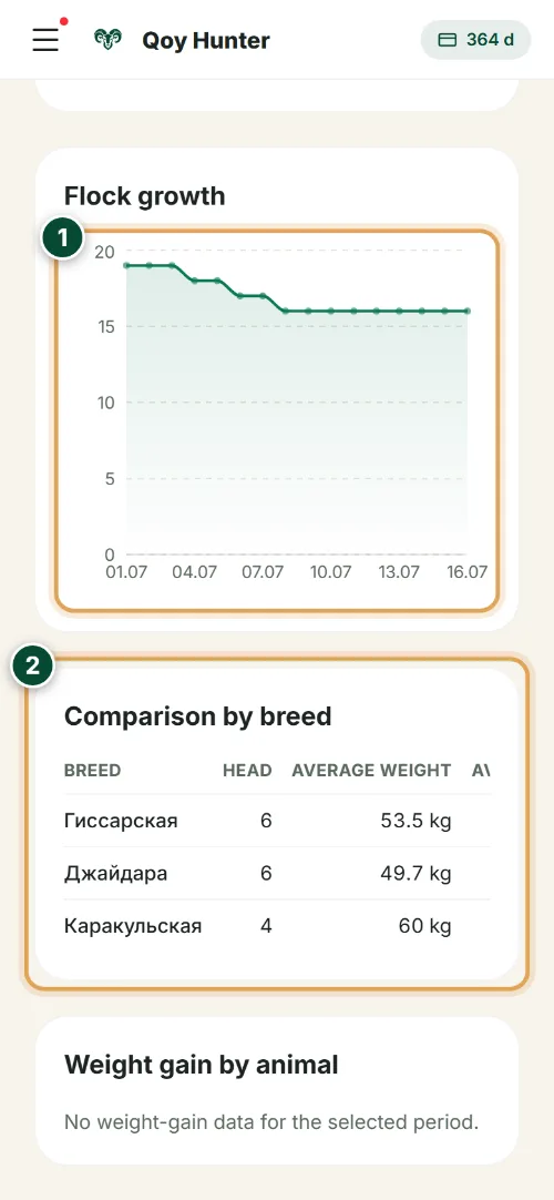
- 1
The headcount growth chart: how the number of head in the flock changed — additions, sales and losses on one line.
- 2
Breed comparison: head count and average weight for each breed in the flock — which breed is heavier and more profitable to fatten.
The numbers mark the key elements on the screen
You see the farm in numbers, not by guesswork.
It's clear what makes a profit and what makes a loss.
It's easy to compare breeds against each other.
Decisions are made on facts.
More features
All featuresBring order to your farm
Put your flock into QoyHunter — records, health, finances and reminders in one app.